Making DxC worth trusting again
A shared component library, then a redesigned planning flow for the platform where Diageo plans around 100,000 events a year.
2024
TL;DR
Diageo plans around 100,000 events a year in DxC. The platform had grown one screen at a time, and teams had stopped trusting it.
They planned in spreadsheets, Tableau and Google Forms, and used DxC only to record what was already decided.
We started by building a shared component library with engineering. Then we used it to redesign Planning Non Premise, the module where brand sponsorships and activations are planned and approved.
I worked across research, interaction design, the component library, documentation and handoff.
- 90%
- task completion in usability testing
- ~35%
- fewer UI bug reports
Background
A platform people worked around
Diageo is one of the largest spirits companies in the world. DxC is where its teams plan and approve brand presence at events: names, dates, sponsorship deals and activation budgets.
New modules were on the roadmap. Users kept asking for the same thing: simpler processes.
Problem
Easy to fill in, hard to trust
The same event lived in four places, and none of them agreed. Every new feature added another layer of inconsistency on top.
“DxC planned events are not a source of truth because information is scattered around multiple tools.”
Our North Star
How might we make DxC the place where events are planned, not just recorded?
Research
Rounds of listening
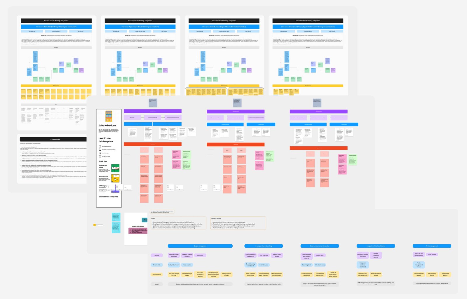
Before the interviews, we went through a process of getting to know the platform and its complexity: every page, action and role in Planning Non Premise.
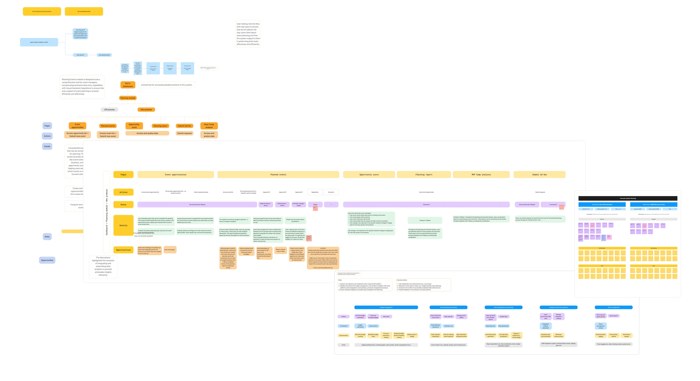
We ran three rounds of interviews with US based Regional Directors, Senior Managers, Directors of Experiential Production and planning teams. Each round built on the one before.
I used AI to cross reference notes across all three rounds and surface recurring patterns faster, then checked every cluster against the raw notes before it went into the affinity diagram. From there, we built a map of problems and opportunities across six areas, from budget management to photo management.
Key insights
Data lived everywhere except DxC.
Requests came in through a Google Form, analysis happened in Tableau, and without a Salesforce integration the same data was typed in twice.
Nobody could see the budget.
Checking the total cost of an event meant opening it.
The form fought the task.
One long page with no structure, where sponsorship and activation were entered separately even though people think about them together.
Navigation broke focus.
Filters reset every time someone opened an event and came back.
We used these methods to turn the insights into a shared MVP scope with PMs and engineering:
Process
Decisions, and what they cost
-
01
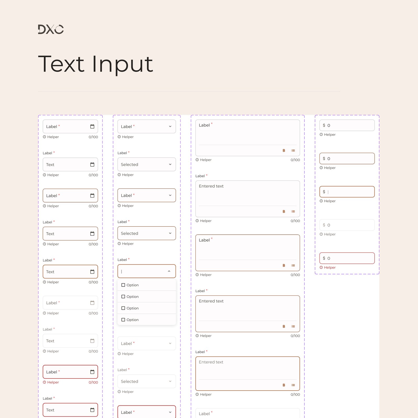
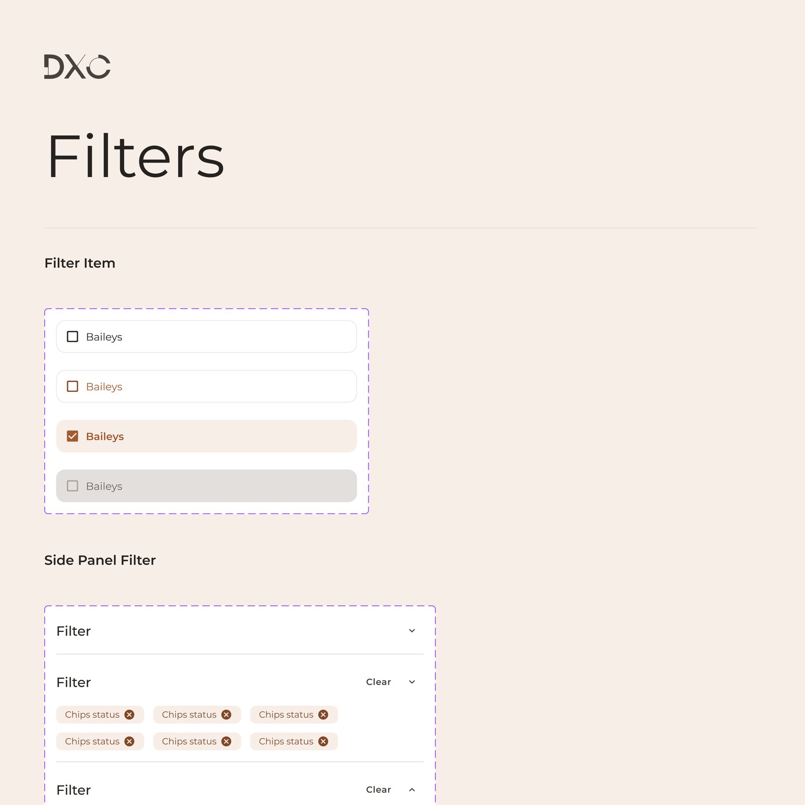
Foundation before features
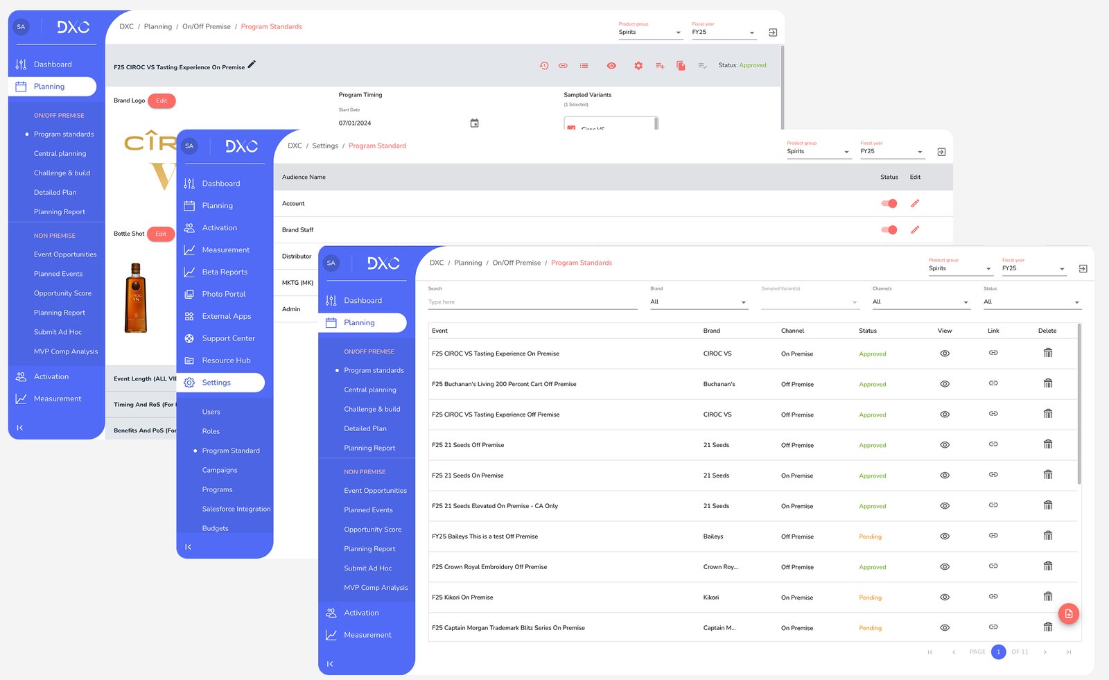
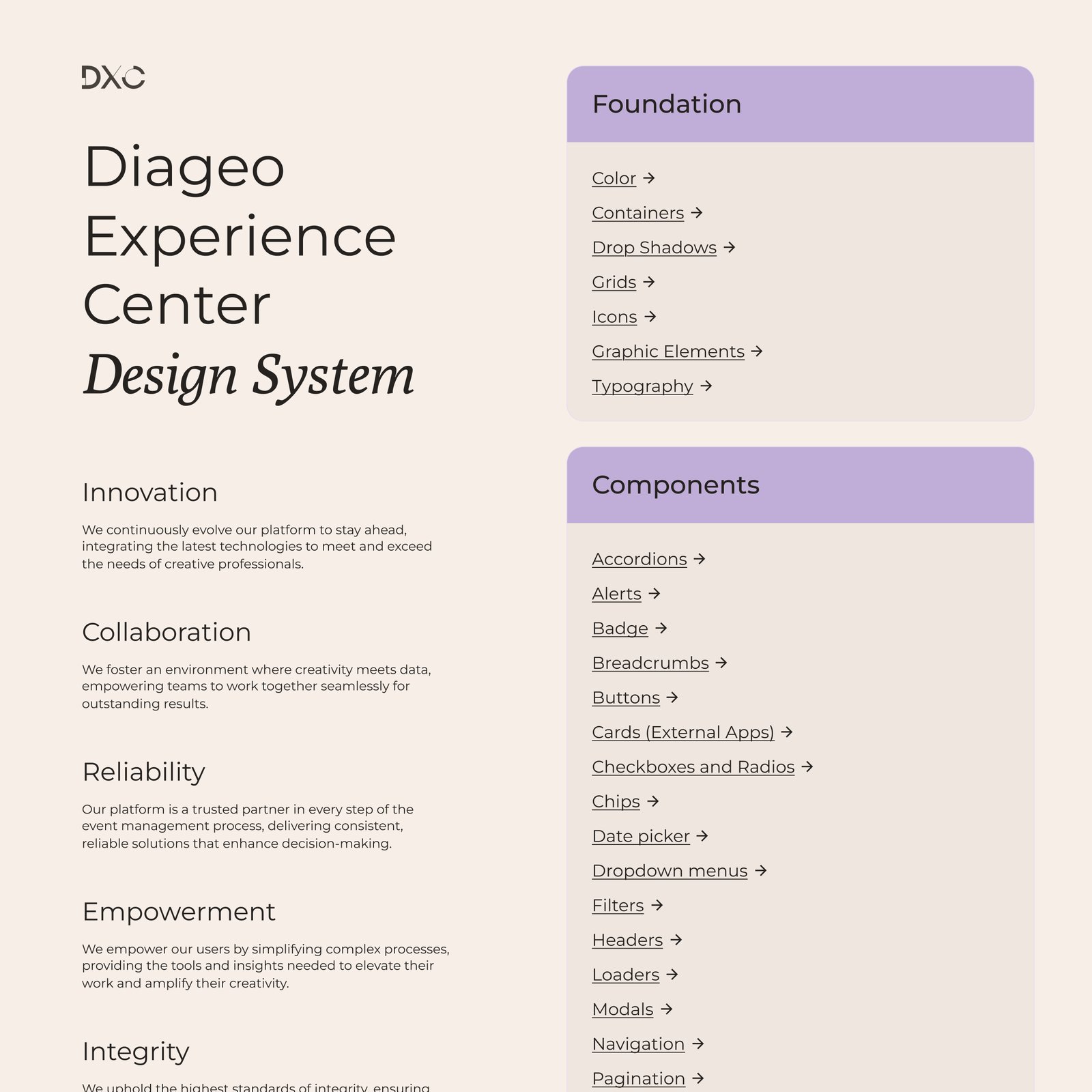
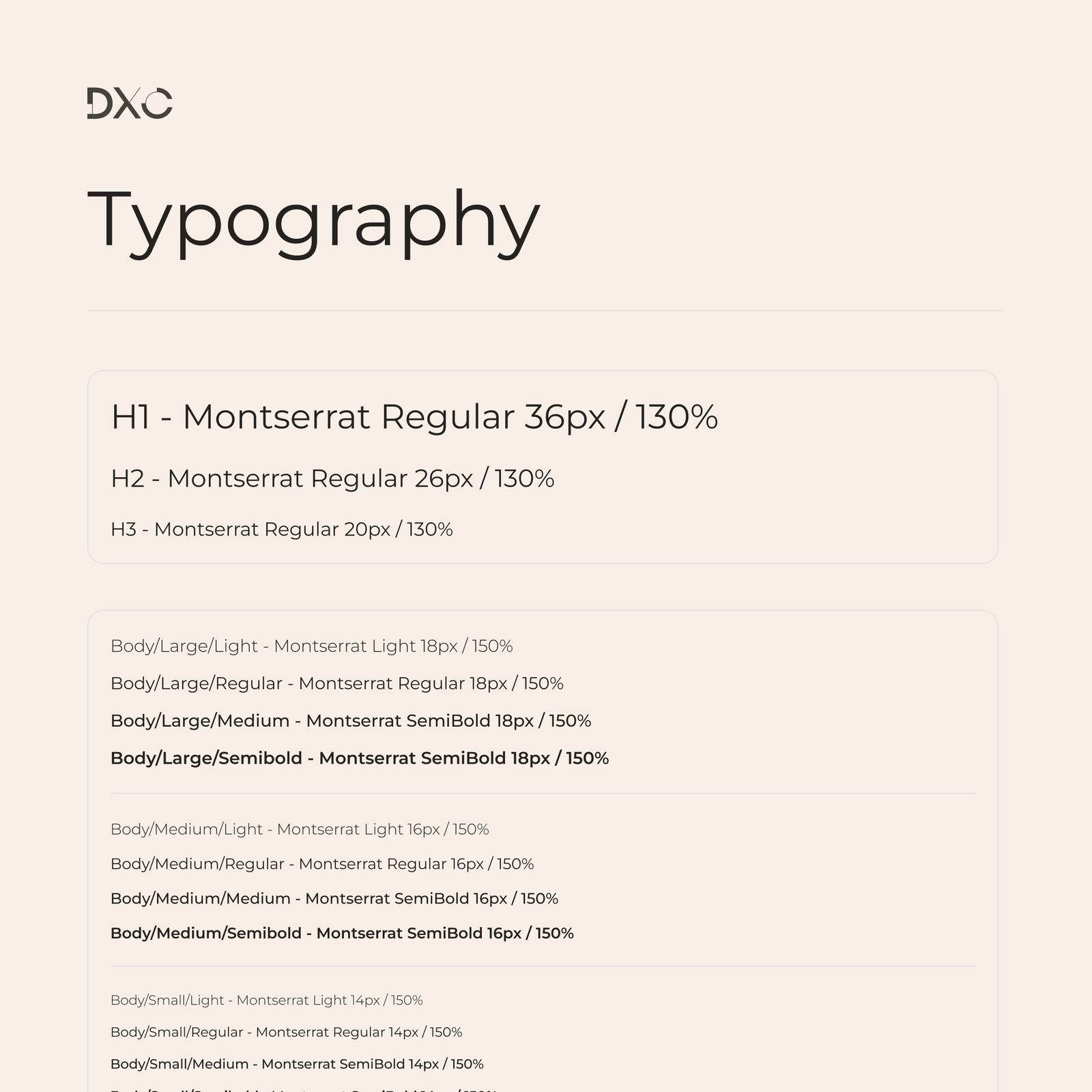
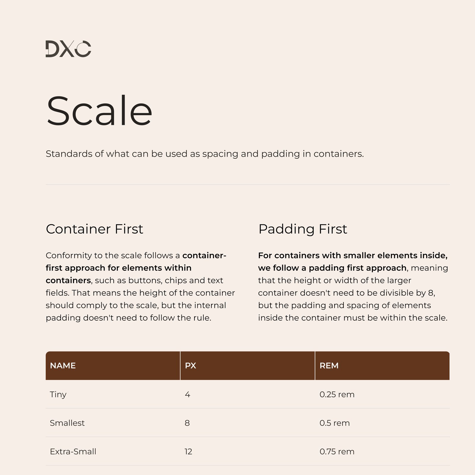
The quick option was to redesign the module on top of the existing UI. Instead, the design team proposed building a component library first, together with the frontend lead in Storybook, with weekly reviews. It slowed the first months down. In return, every screen after that was built from the same parts.
-
02
Splitting the form the way people think
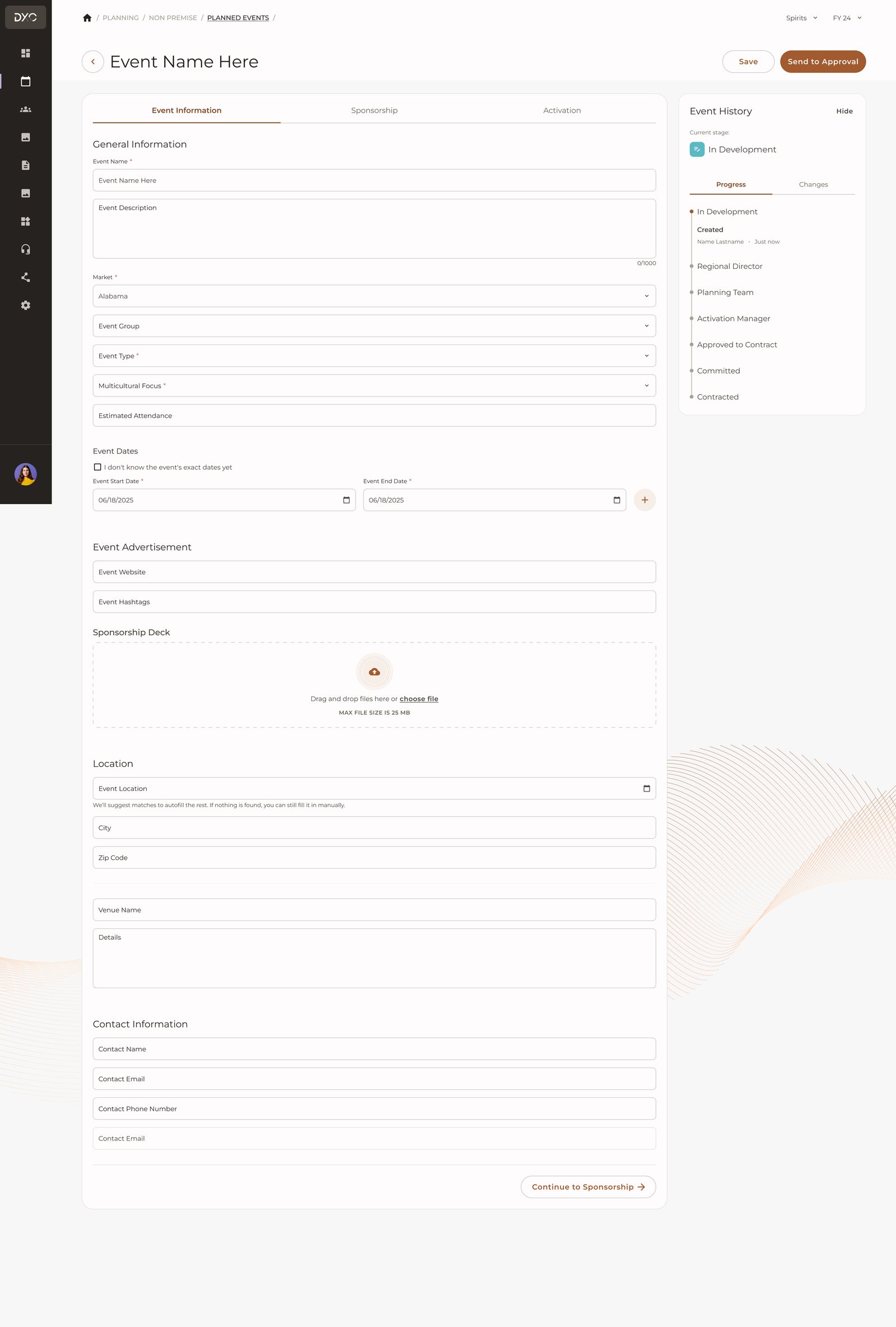
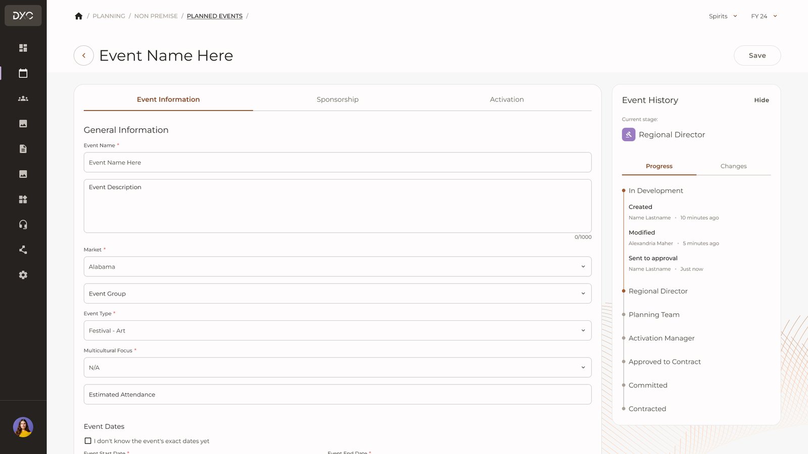
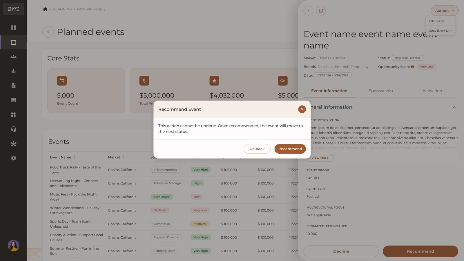
The single page became three tabs: Event information, Sponsorship and Activation. Approval history stays visible in a side panel the whole time. Tabs hide fields, so we added validation on each tab, showing exactly what is missing before anyone submits.
-
03
Budget at a glance
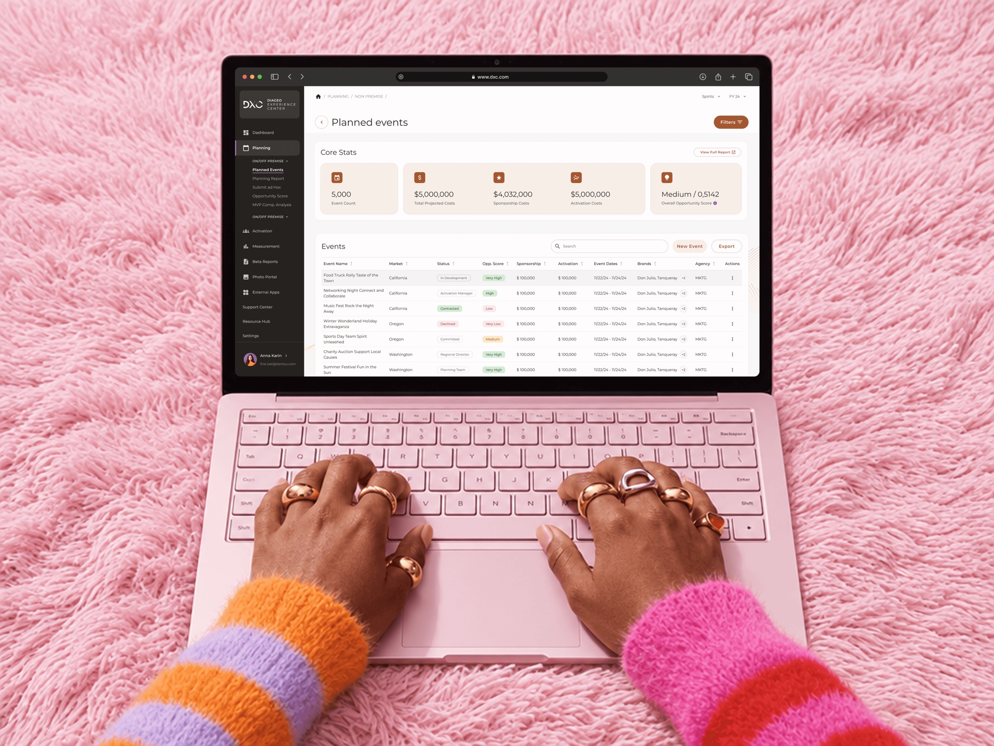
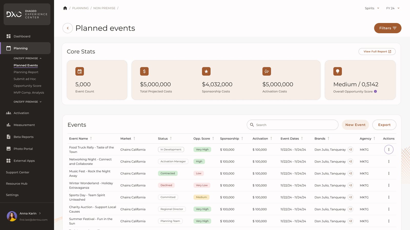
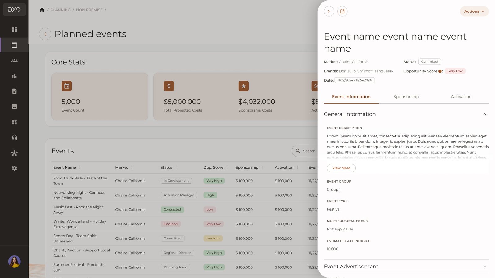
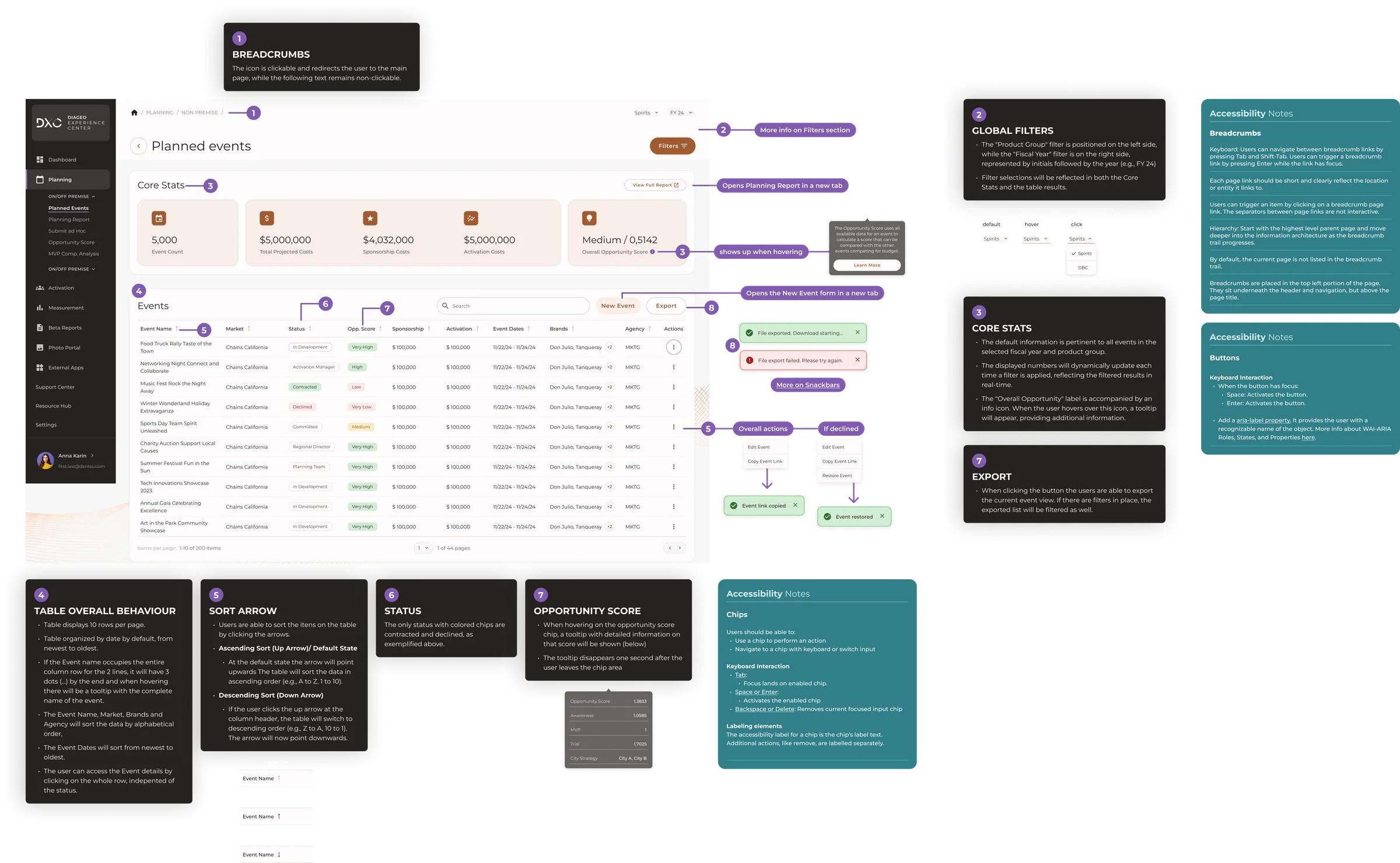
A Core Stats dashboard shows event count, projected cost, sponsorship and activation spend, and opportunity score. We kept only the numbers approvers actually use to make decisions and left the rest for detailed views.
-
04
Approve without losing your place
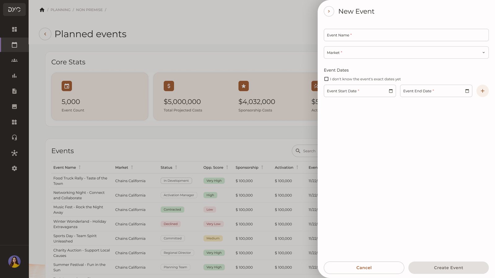
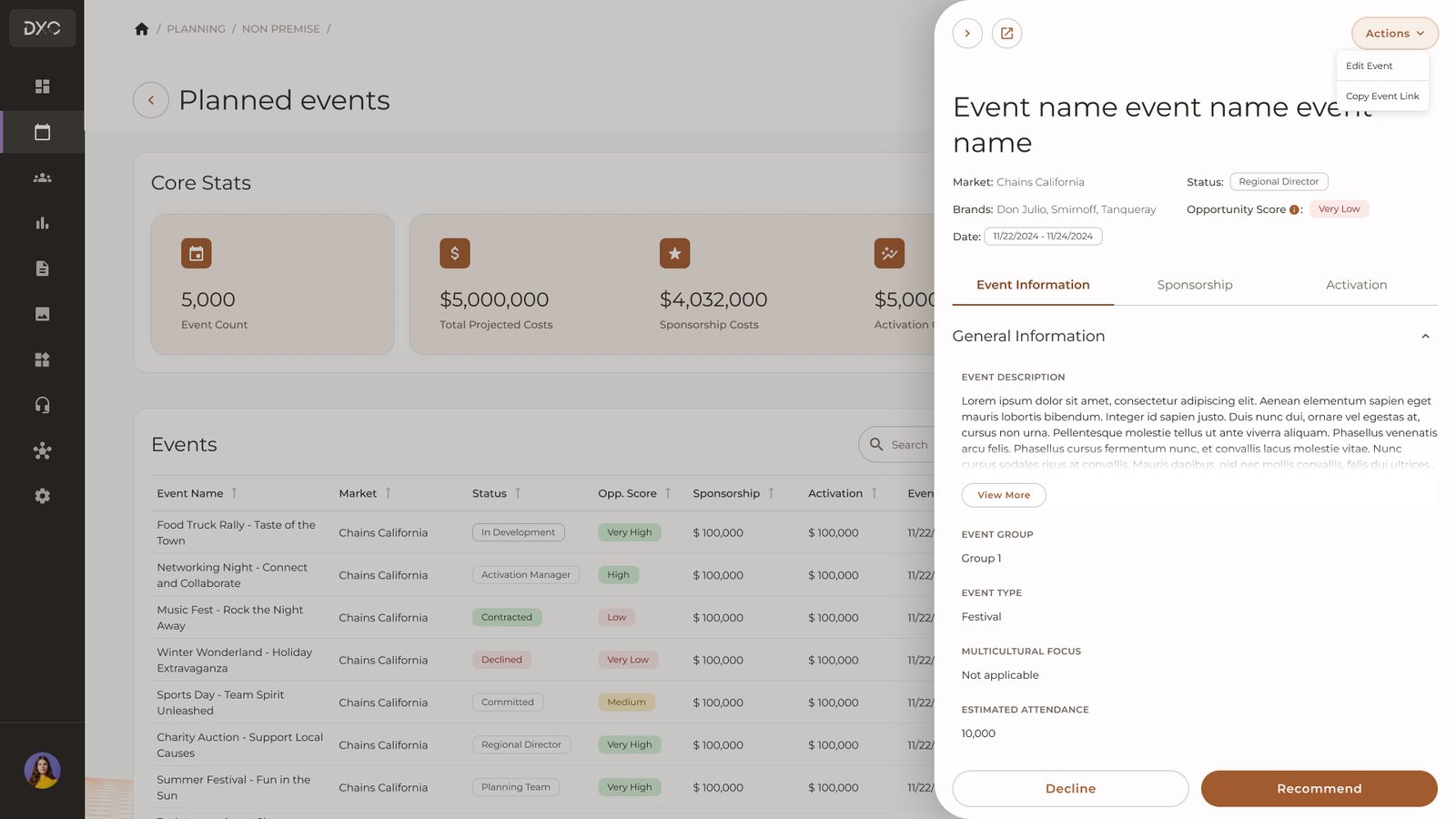
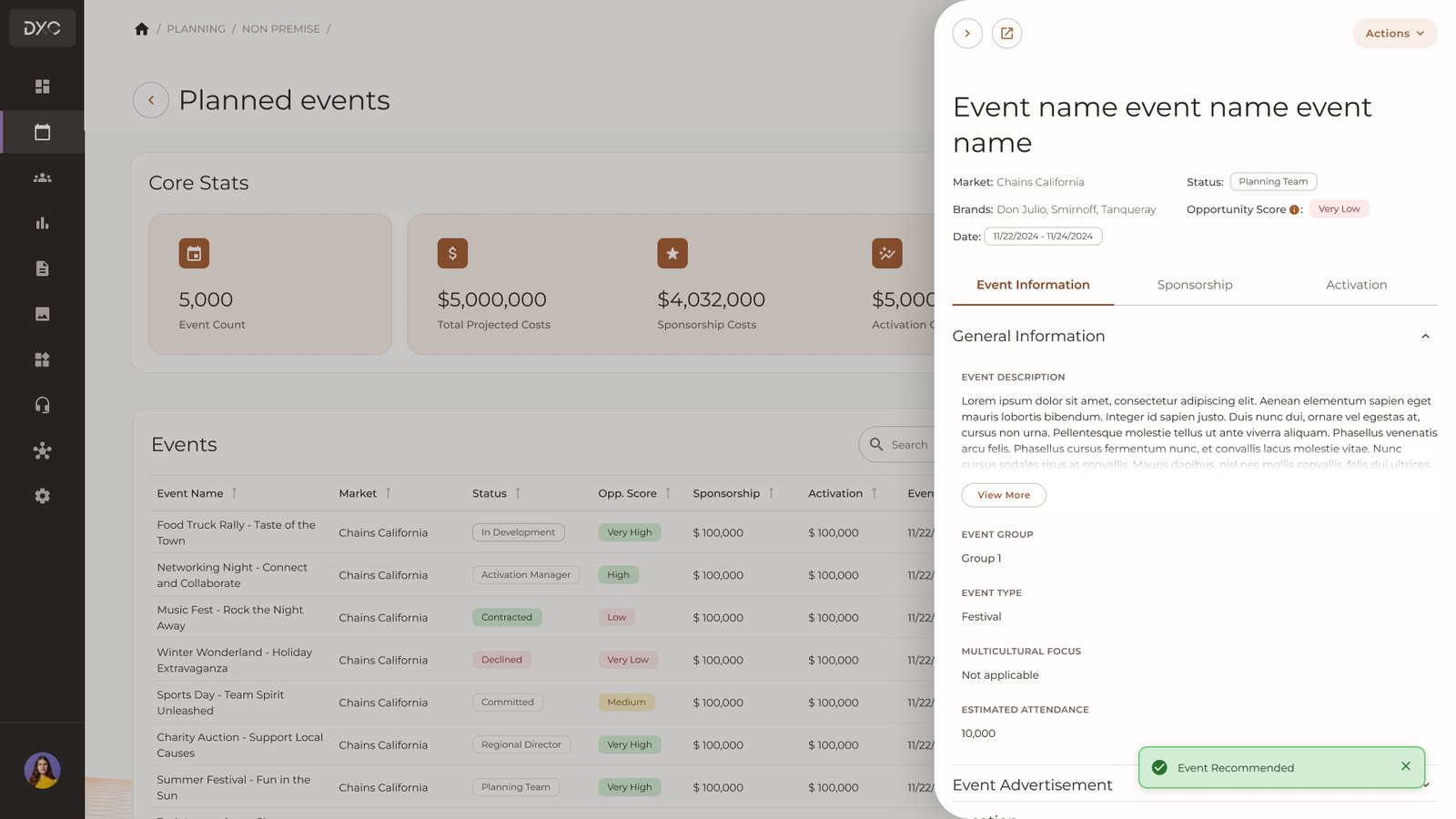
Event details open in a side panel over the list. Approvers can review, approve or decline from there, and their filters stay exactly where they left them.
-
05
Low fidelity on purpose
We tested clickable wireframes, not polished UI, so feedback stayed on the flow and we could iterate between sessions.
-
06
Documentation as part of the product
A library only works if people know how to use it. I documented every component in Confluence with usage guidelines, states and accessibility requirements. Handoff specs came with annotations covering behavior, keyboard interaction and ARIA notes. The guidelines became a shared reference for the whole team, including PMs and QA, not just design and frontend.
Testing
90% task completion before launch
Four participants, Regional Directors and Senior Managers, completed five tasks in moderated sessions.
- 90%
- overall task completion
- 3 of 5
- tasks reached 100%
What testing changed
- Shipped
The calendar control needed more prominence, so we made it more visible.
- Added to MVP
Prefilled fields came up as the biggest way to reduce effort, so they went into the MVP.
- Backlog
Saved filters were valuable but not essential, so they went into the backlog for after launch.
Final product
From four tools to one flow
Before · four places
- Google Formwhere requests came in
- Spreadsheetswhere planning happened
- Tableauwhere budgets were analyzed
- DxConly to record what was decided
After · one flow in DxC
- PlanOne form, three tabs: event information, sponsorship and activation
- Check the budgetCore Stats show cost and spend at a glance
- ApproveFrom a side panel, without losing filters

Impact
- 90%
- task completion in usability testing
- ~35%
- fewer UI bug reports
- One
- shared library across modules
The library became the starting point for the platform wide redesign that followed.
Reflections
A design system starts with alignment, not components.
Building side by side with engineering made the library something the team actually used, instead of a Figma file nobody opened.
Next time
I would bring developers in from the first audit, and I would set up adoption tracking from launch. We measured usability before release, but we lacked clear data on how many teams stopped using spreadsheets afterward.
Want the full story?
There's a lot more behind this case than fits on a page.
The research that changed our direction, the trade-offs we argued about, and what I'd do differently today. I'm happy to walk you through it.